Blog
24 Agile Test Metrics Every QA Team Should Know

Virtuoso QA
Published on

Table of contents
Lorem ipsum
Lorem ipsum
Lorem ipsum
Lorem ipsum
Lorem ipsum
Two QA leaders sit across the same boardroom table on a Tuesday morning. Identical reports. The same number of automated tests, the same pass rate, the same coverage figure on the dashboard. One leads a team that ships every fortnight without incident. The other loses a day per sprint to production hotfixes. The numbers do not explain the difference. The right numbers would have.
This is the working reality in most agile programmes. Metrics get tracked because they are easy to collect. They fall off the dashboard because they are easy to ignore. The connection between what gets measured and what gets delivered is weaker than most teams would like to admit.
This guide covers the five categories of agile test metrics that matter, the metrics that mislead, how to build the right portfolio for your team's maturity, and why AI-generated code is forcing a shift toward outcome-based measurement that most dashboards are not yet ready for.
What Are Agile Test Metrics?
Agile test metrics are quantitative measures of how a software testing programme performs across velocity, coverage, quality, automation reliability, and customer outcome. Each metric answers a specific question. The questions are not equally important and they are not equally honest.
A metric is honest when it correlates with the outcome the team actually cares about. A metric is misleading when it correlates with effort rather than effect. A metric is actively harmful when it can be optimised in isolation at the expense of outcomes other metrics are trying to capture.
The shift underway in mature agile programmes is from activity metrics, which describe what the testing team did, toward outcome metrics, which describe whether the customer outcome held. Both layers matter. The centre of gravity is moving toward the customer.
Why Agile Test Metrics Matter
Without metrics, release decisions are made on confidence rather than evidence. With the wrong metrics, release decisions are made on the wrong evidence, which is worse.
The right metrics give teams four things that gut feel cannot.
1. Early warning
A rising flaky test ratio or a falling first-time pass rate signals a problem before it becomes a release incident. Metrics that predict problems are worth more than metrics that describe them after the fact.
2. Honest performance assessment
An escaped defect rate that is rising while the automated test count is also rising is a signal that the testing programme is growing in volume but not in effectiveness. Only the combination reveals the truth.
3. Release confidence
A team that can point to behaviour coverage, journey health, and a stable automation suite has evidence for a release decision. A team that can only point to test counts does not.
4. Continuous improvement
Metrics that are tracked consistently over time reveal trends. A defect cycle time that is rising across three consecutive sprints is a capacity problem that will become a release problem. Catching it at the metric level is cheaper than catching it at the customer level.
Leading Indicators vs Lagging Indicators
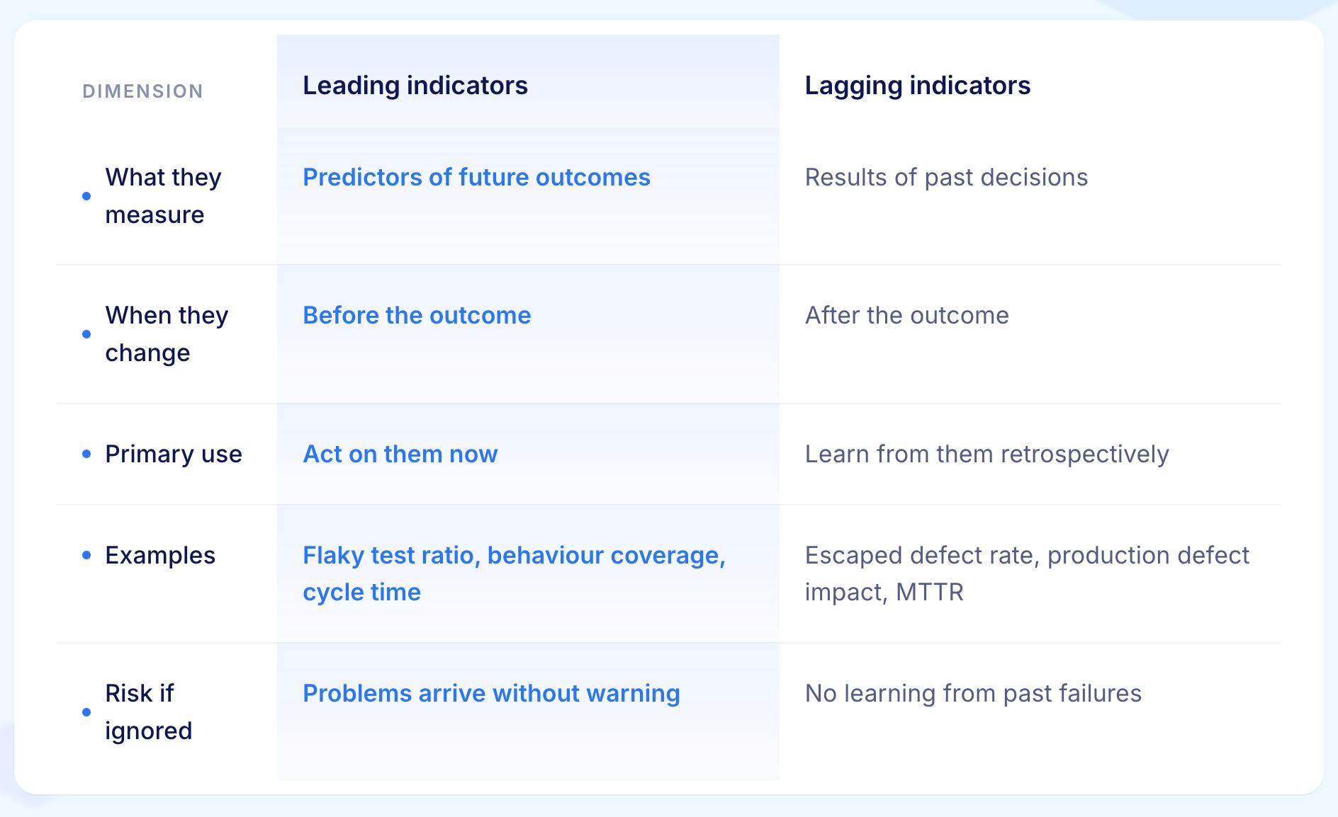
Not all agile test metrics measure the same thing in time. Some metrics tell you what is likely to go wrong before it goes wrong. Others tell you what went wrong after it already happened. The first group are leading indicators. The second are lagging indicators.
Most agile test dashboards mix the two without labelling them, which confuses the audience and weakens every metric on the page. A rising flaky test ratio and a rising escaped defect rate are both worth tracking, but they require completely different responses.
One tells you to act now. The other tells you to learn from what already happened.
Leading indicators predict future outcomes. They change before the thing they are predicting changes. A rising flaky test ratio predicts a future decline in release confidence. A falling behaviour coverage predicts a future rise in escaped defects. Leading indicators are the metrics to act on.
Lagging indicators describe outcomes that have already happened. Escaped defect rate, production defect impact, and customer-reported issues all describe the result of decisions made weeks or months earlier. Lagging indicators are the metrics to learn from.
The Five Categories of Agile Test Metrics
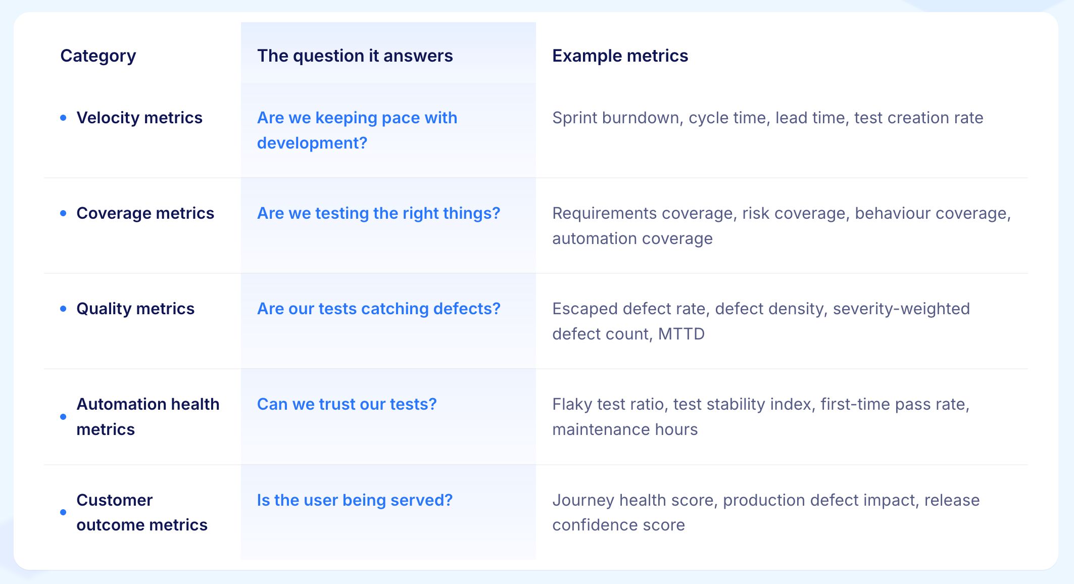
A working metric portfolio covers five categories. Each answers a different question. No single metric in any category is sufficient on its own, and tracking metrics from only one or two categories produces selective confidence, which is the failure mode the opening story illustrates.
24 Agile Test Metrics Every QA Team Should Know
The metrics below are organised across the five portfolio categories. Each metric is explained in plain language with what it measures, why it matters, and what a problematic signal looks like in practice.
Velocity Metrics
Velocity metrics tell the team whether the testing pace matches the development pace. The gap between the two is where production defects accumulate.
1. Sprint Burndown
Charts the remaining work in a sprint against time. Used well, it surfaces blockers early. Used badly, it becomes a reporting artefact that hides the testing portion behind a single line.
The most useful version separates testing burndown from development burndown so the team can see whether testing is keeping up or falling behind.
2. Cycle Time
Measures how long a unit of work takes from entering the testing stage to leaving it. The metric correlates closely with release predictability. A team with low and stable cycle time can make release commitments. A team with high and variable cycle time cannot. Cycle time is a leading indicator worth watching weekly.
3. Lead Time
Measures the elapsed time from a requirement being committed to being released. The metric captures the whole delivery flow rather than just the testing portion. Useful for engineering leaders who need a single throughput signal across the whole team.
4. Test Creation Rate
Measures how many new tests the team produces per sprint. The metric is meaningful when paired with quality signals. Without quality signals, a rising test creation rate rewards quantity over value and tells the team nothing about whether the new tests are catching anything.
5. Test Execution Rate
Measures how many tests run per unit of time and what percentage pass. Useful for capacity planning and for tracking CI cost trends over multiple sprints.
Coverage Metrics
Coverage metrics tell the team whether the testing programme is exercising the parts of the system that matter. Coverage is necessary. Coverage alone is not sufficient.
6. Requirements Coverage
Measures the percentage of documented requirements that have at least one test case mapped to them. A requirement without a test is a decision to take a risk rather than verify a behaviour. Requirements coverage is the floor of any rigorous testing programme.
7. Risk Coverage
Measures the percentage of high-risk areas that have proportional test coverage. The discipline of risk-weighting, allocating more coverage to higher-risk areas rather than distributing coverage uniformly, consistently produces a fall in escaped defects without a rise in total test count.
8. Automation Coverage
Measures the percentage of testing that is automated. The metric is widely tracked and widely misinterpreted. High automation coverage with brittle, frequently failing tests is worse than lower coverage with stable, trustworthy tests. Automation coverage must always be paired with automation health metrics to be honest.
9. Code Coverage
Measures statement, branch, or path coverage at the unit and integration layers. Useful at the developer layer. Less useful as a portfolio-level metric for QA leadership because the relationship between code coverage and whether the user can complete a task is indirect at best.
10. Behaviour Coverage
Measures the percentage of customer-critical journeys that are verified end to end. The metric is the most direct proxy for whether the user-facing system is being tested where it matters. A checkout journey that is not in the behaviour coverage register is a journey that could break in production without the test suite detecting it.

Quality Metrics
Quality metrics tell the team how good the testing is at catching defects before customers do. These are the metrics most leaders look at first and the ones most often misread.
11. Escaped Defect Rate
Measures the percentage of defects detected after release rather than before. The metric is one of the most honest signals of testing programme effectiveness. A rising escaped defect rate is rarely a measurement problem. It is almost always a real problem.
12. Defect Density
Measures defects per unit of code or per feature. Useful when normalised consistently across releases. Misleading when the unit of measure changes between releases or when severity is not accounted for.
13. Severity-Weighted Defect Count
Measures total defects with each weighted by its severity level. A release with five critical defects is not equivalent to a release with fifty cosmetic ones. Raw defect count hides this difference. Severity-weighted count surfaces it.
14. Defect Reopen Rate
Measures the percentage of resolved defects that are reopened. A high reopen rate usually points to a verification gap, meaning fixes are being closed without being properly retested, rather than a development gap.
15. Defect Cycle Time
Measures the elapsed time from a defect being raised to being resolved. A rising defect cycle time usually signals a capacity problem before it signals a quality problem.
16. Mean Time to Detect (MTTD) and Mean Time to Resolve (MTTR)
Measure the team's responsiveness to production issues. MTTD belongs in quality metrics because detection speed is a direct measure of how quickly the testing programme surfaces real problems. MTTR belongs in customer outcome metrics because resolution speed determines how long customers are affected.
Automation Health Metrics
Automation health metrics tell the team whether the automated test estate itself is in good shape. A test suite the team cannot trust produces noise rather than signal.
17. Flaky Test Ratio
Measures the percentage of tests that pass and fail intermittently without any code change. A flaky test ratio above five percent corrodes trust in the entire suite regardless of the overall pass rate. When tests are unreliable, developers stop acting on failures and the suite stops doing its job.
18. Test Stability Index
Measures the percentage of tests that pass consistently across runs. A stability index below ninety percent typically means the team is running tests they cannot rely on as a basis for release decisions.
19. First-Time Pass Rate
Measures the percentage of test runs that pass on the first execution. A low first-time pass rate often reveals environment, data, or infrastructure problems that have nothing to do with the system under test but consume significant investigation time.
20. Test Maintenance Hours
Measures the time the team spends keeping existing tests aligned with the current application. A programme with high maintenance hours and low new test creation has a structural problem that adding headcount will not solve.
21. Average Run Time
Measures the time required to execute the full suite. A suite that takes four hours to run will be run less often, which reduces the value of every test in it.
Customer Outcome Metrics
Customer outcome metrics tell the team whether the customer journey is actually working. This is the category most often missing from agile test metric programmes and the one most directly correlated with the outcomes the business cares about.
22. Journey Health Score
Measures the percentage of customer-critical journeys that are verified continuously and currently passing. A checkout journey that is in the journey health register and currently failing is a visible, actionable signal. A checkout journey that is not in the register at all is invisible risk.
23. Production Defect Impact
Measures the customer-visible consequence of defects that reach production: affected session volume, revenue impact, and support ticket volume. The metric is the most honest answer to the question "did our testing programme matter this release."
24. Release Confidence Score
A composite metric that combines behaviour coverage, recent test pass rates, change-risk indicators, and historical failure probability into a single number per release. It gives decision-makers a single signal to act on rather than requiring them to synthesise multiple individual metrics.
Mature programmes are beginning to treat it as the standard signal for release decisions in the same way uptime became the standard signal for site reliability.

The Metrics That Mislead
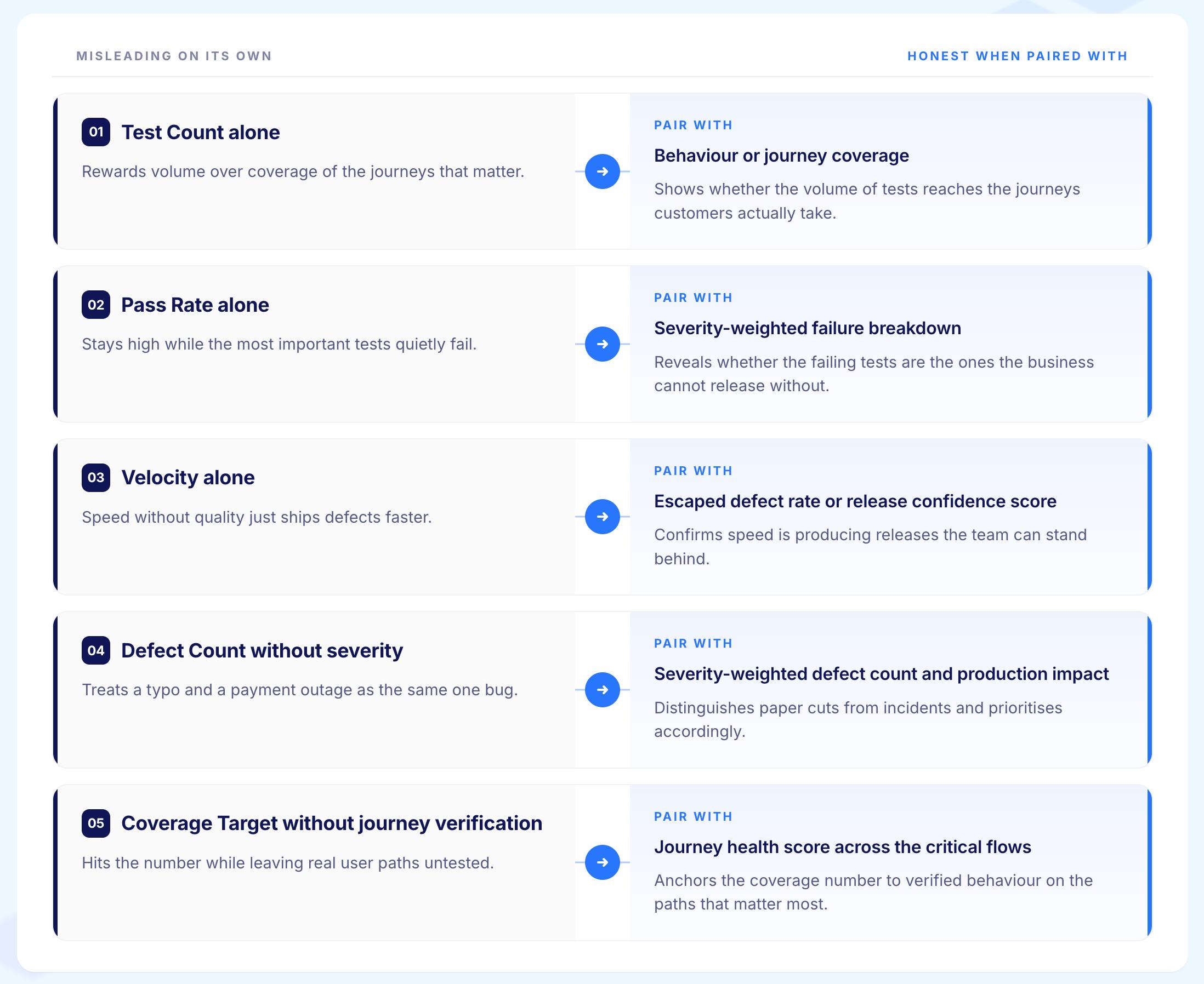
A serious metric portfolio includes retiring metrics that look useful and are not. Five patterns account for most of the wasted dashboard space in agile test programmes.
1. Test Count as a Measure of Progress
Adding tests is easy. Adding tests that catch defects is hard. A programme that rewards test volume produces test volume. Whether the defect detection rate moves is a separate question that raw test count cannot answer.
2. Automated Test Pass Rate Without Quality Context
A 100% pass rate on a suite that does not exercise the riskier paths looks healthy and provides no protection. Pass rate must be paired with behaviour coverage and escaped defect rate to be meaningful. Pass rate alone is a measure of how well the tests pass, not of how well the system works.
3. Velocity Without Quality
Velocity rising while escaped defect rate is also rising is not velocity. It is technical debt accumulating faster than the dashboard has noticed. The two metrics must be tracked together or velocity becomes a vanity figure.
4. Defect Count Without Severity Weighting
A flat defect count hides severity shifts. Five critical defects and fifty cosmetic ones look identical on a raw count and represent entirely different release risks. Every defect count metric should carry severity context.
5. Vanity Coverage Targets
A team required to achieve ninety percent statement coverage will achieve ninety percent statement coverage. Whether the coverage reflects anything meaningful is a different question. Coverage targets should always be paired with journey-level verification to have honest content.
The discipline of retiring misleading metrics is harder than the discipline of adding new ones. The teams that practise it ship better software because they act on honest signals rather than comfortable ones.
How to Build the Right Metric Portfolio for Your Team
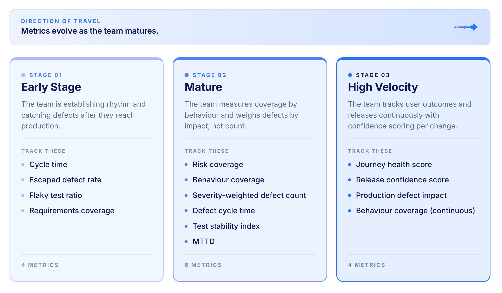
The right portfolio depends on three variables: the team's maturity, the system's risk profile, and the speed of the development organisation. The goal is not to add metrics. The goal is to track the right ones and retire the wrong ones as the team grows.
Step 1: Start With Four Foundational Metrics
What to Do:
Pick one metric from each of four categories: velocity, quality, automation health, and coverage
Track them weekly for a full sprint cycle before adding anything
Do not add a fifth metric until the team is acting on all four
Why it Matters:
Four metrics tracked weekly and acted on consistently produce more improvement than fifteen metrics tracked sporadically and discussed in retrospectives. The value of a metric is in the decision it changes, not in the data it generates.
Step 2: Add Risk and Behaviour Metrics as the Programme Matures
What to Do:
Replace requirements coverage with risk coverage once the team has a clear view of which areas carry the most business risk
Add behaviour coverage as a coverage metric alongside or instead of automation coverage
Add severity-weighted defect count to replace raw defect count in quality reporting
Why it Matters:
Uniform coverage applied to all requirements treats a login form and a payment processing journey as equally important. Risk-weighted coverage allocates more depth to the higher-stakes areas, which is where escaped defects cluster.
Behaviour coverage moves the measurement closer to the customer outcome, which is what the business actually cares about.
Step 3: Move to Outcome Metrics for Executive Reporting
What to Do:
Add journey health score, production defect impact, and release confidence score to the portfolio
Present these as the executive view while activity metrics remain as the practitioner view
Review the full portfolio quarterly and retire any metric that nobody is acting on
Why it Matters:
The question changes as the audience changes. A QA practitioner needs to know which tests are failing and why. An engineering leader needs to know whether the release is safe to ship.
An executive needs to know whether the customer outcome is being protected. Each audience needs a different metric layer. A single dashboard that serves all three audiences usually serves none of them well.
How AI-Generated Code is Reshaping Agile Test Metrics
The metric set that was adequate for human-paced development strains under AI-assisted development. Three pressures are now visible.
1. Volume Pressure
AI tools raise the number of changes per sprint sharply. Coverage metrics that were marginally adequate at human pace become misleading at agent pace because the denominator grows faster than the numerator.
A team tracking 70% automation coverage while the application doubles in size is measuring a shrinking proportion of a growing system.
2. Brittleness Pressure
AI-generated code is more frequently refactored, which breaks test cases written against specific implementation details. Flaky test ratios climb and automation health metrics deteriorate not because the tests are worse but because the underlying code is changing faster than the tests can follow.
Teams that measure maintenance hours see the cost of this clearly. Teams that do not measure it absorb it invisibly.
3. Behavioural Drift Pressure
AI agents make local changes that pass structural verification while shifting customer-facing behaviour in ways the existing tests do not detect. A unit test can pass while the user journey it supports silently breaks. Coverage and pass rate stay flat. Behaviour coverage and customer outcome metrics catch the drift earlier because they are measuring at the layer where the customer experiences the product.
The implication for metric portfolios is direct. Move coverage measurement closer to the customer journey layer and away from the code layer. Treat behaviour coverage and journey health as primary metrics rather than supplementary ones.
Add AI-specific health checks: test regeneration rate, contract drift velocity, and behaviour delta between releases.
From Activity Metrics to Outcome Metrics
The deeper shift is visible once the five categories are understood. Activity metrics describe what the testing team did. Outcome metrics describe whether the customer outcome held. The two can diverge completely.
A team optimising for activity metrics runs more tests, tracks coverage with discipline, and maintains a rising test creation rate. A team optimising for outcome metrics asks whether the customer journey is working, whether release confidence is high, and whether production defect impact is trending down. Both teams can produce identical activity dashboards and entirely different customer outcomes.
The mature position is to keep activity metrics as practitioner inputs and outcome metrics as the executive view. The practitioner dashboard still shows test counts, pass rates, and coverage. The executive dashboard shows journey health, release confidence, and escaped defect rate. The hierarchy mirrors the way the question changes as the audience changes.
The teams that make this shift first hold an advantage that compounds over time. When activity metrics are commoditised by toolchain automation, the teams that have already built outcome measurement have a head start on the next evolution.
How Virtuoso QA Powers Outcome-Based Metrics
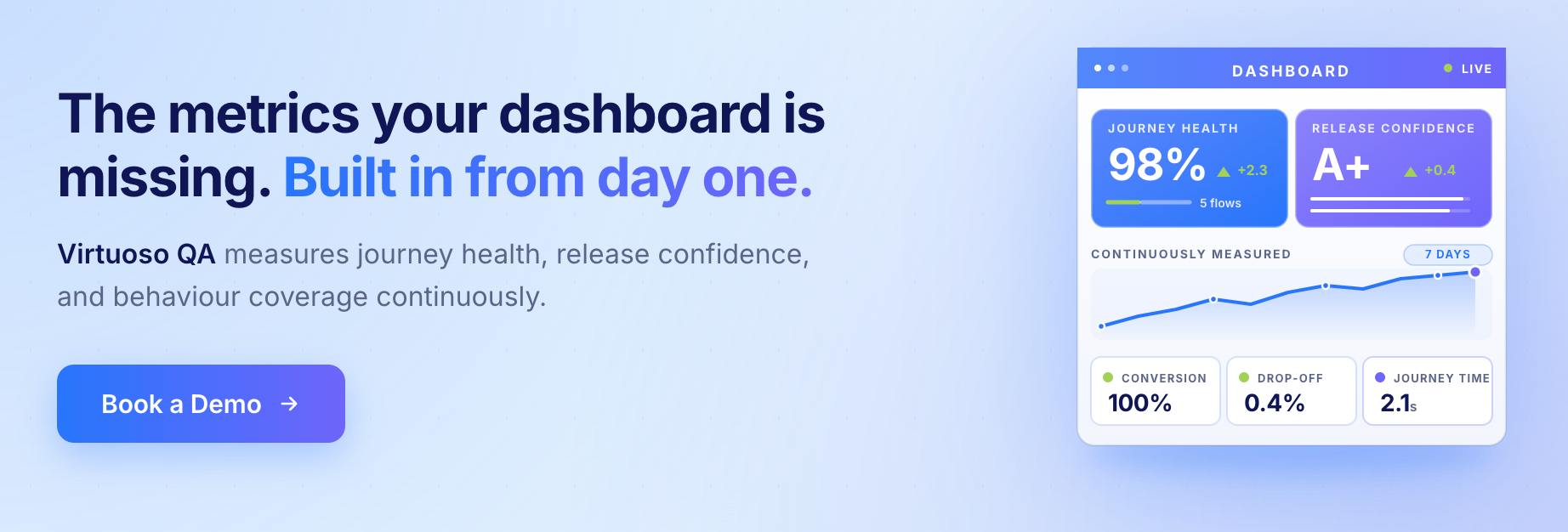
Most testing platforms make activity metrics easy to collect and outcome metrics hard to find. Virtuoso QA is built the other way around.
Behaviour Coverage Scales With Development Velocity
GENerator produces verification assets from requirements, user stories, Figma designs, and Jira tickets, so the behaviour coverage register grows as fast as the development organisation ships rather than lagging behind it.
The Flaky Test Ratio Stays Low Automatically
Self-healing AI keeps tests aligned with the application as the interface changes, which means tests do not break when the UI is updated and the flaky test ratio does not spike after every release.
MTTD Drops Because Root Cause is Surfaced Immediately
AI Root Cause Analysis explains the cause of every failure at the moment of detection rather than requiring a separate investigation. Teams that used to spend two hours diagnosing a failure spend twelve minutes.
Journey Health is Measured Continuously, Not Quarterly
Composable testing libraries let each customer-critical journey be expressed as a named, reusable module that runs on every release. The journey health score reflects the current state of production-representative testing rather than the last pre-release snapshot.
Related Reads
Frequently Asked Questions
What are the most important agile test metrics?
What is the difference between agile metrics and traditional testing metrics?
What is sprint burndown in agile testing?
How do you measure test quality in agile?
What metrics should agile QA teams stop tracking?
How does Virtuoso QA measure release confidence?