
Blog
CSS Cross-Browser Compatibility Issues and How to Fix

Published on
June 26, 2026


Learn why CSS breaks across browsers, the common layout issues to watch for, and the disciplines and tools that keep stylesheets consistent everywhere.
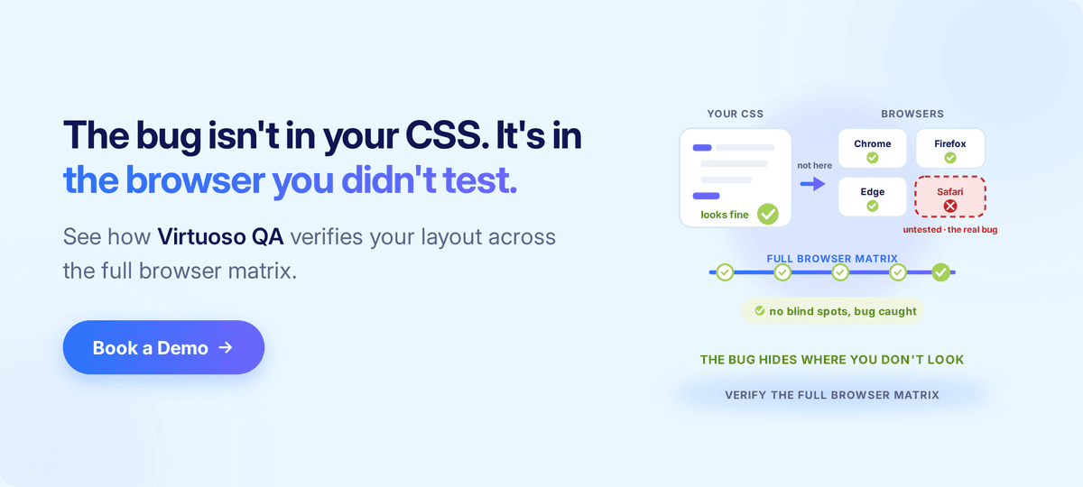
CSS cross-browser compatibility is the practice of writing and maintaining stylesheets that render consistently across the browsers, devices, and operating systems real customers actually use. The goal is not pixel-perfect uniformity, because that has never been what the web platform offers. The goal is that every user sees a layout that works, on every browser version the audience runs, every time the site ships.
It helps to understand where the problem sits today. In 2022 the major browser vendors, together with a group of supporting engineering organisations, launched the Interop initiative, and the idea behind it was simple. Each year the participants publish a list of the web-platform features causing the most cross-browser pain, then commit publicly to fixing them, and each successive dashboard has shown measurable improvement on the year before. The initiative is one of the most important things to have happened to web development in two decades, and it is also a reminder of the truth underneath it.
Browsers are getting better at agreeing, but they are not yet good at agreeing, and the gap that was once measured in years and whole missing features is now measured in months and subtle rendering edge cases. The gap is smaller. The gap is still there, and every team that ships a website still inherits some part of it.
What follows is the working knowledge a senior front-end engineer would want a junior to read on day one, covering the technical reasons CSS renders differently, the browser landscape that matters now, the categories of layout issue that account for most production bugs, the toolkit and techniques that prevent those issues, and the verification layer that closes the loop between writing compatible CSS and actually shipping it.
CSS cross-browser compatibility describes the degree to which a stylesheet produces equivalent user experiences across the major browser engines, on the operating systems and devices an audience uses. A site is compatible when the layout works, the typography is legible, the interactive elements respond, and the visual hierarchy holds, whichever browser the visitor happens to open.
The definition stops deliberately short of pixel-perfect identity, because pixel-identical rendering across all browsers has never been a goal of the web platform and is not the goal of compatibility work.
Sites will always differ in subpixel rendering, in font metrics, in the native styling of form controls, and in scrollbar behaviour, and none of those differences is a defect. The defects are the ones that change what the user can do, not the ones that change what the user sees down to the half-pixel.
Three properties together signal cross-browser-compatible CSS, and it is worth being explicit about each.
Compatibility is therefore a property of the experience rather than of the stylesheet itself. The same stylesheet can be compatible on one browser matrix and broken on another, which is why the matrix is the thing that gets defined first and the CSS is the thing that gets adapted to it.
For the broader testing discipline that sits above the CSS layer, our browser compatibility testing guide covers how to build and prioritise that matrix.
CSS is a specification, browsers are implementations of that specification, the specification has gaps, and the implementations have bugs. The combination of those facts is the territory web developers actually work in, and four mechanisms account for most of the cross-browser drift seen in practice.
Three engines do most of the work for the modern web. Blink powers Chrome, Edge, and the long list of Chromium-derived browsers, WebKit powers Safari on macOS and iOS and remains the only engine permitted in iOS browsers regardless of brand, and Gecko powers Firefox.
Each engine implements the CSS specification with its own decisions about edge cases, performance trade-offs, and historical bug compatibility, so the same display: flex produces broadly equivalent results across all three, while the same aspect-ratio with a percentage value, used inside a nested flex container, can produce three different layouts in three different ways. Most cross-browser issues live in those edge cases rather than in the headline features.
New CSS features ship at different times in different engines, and the staggered rollout is what catches teams out. Container queries arrived in Safari 16 and Chrome 105 in September 2022 but did not reach Firefox stable until version 110 in early 2023.
The :has() parent selector shipped in Safari 15.4 in March 2022 and Chrome 105 in September 2022, but only became interoperable across all engines when Firefox 121 landed in December 2023. Subgrid had an even longer arc, reaching Firefox in late 2019, Safari in late 2022, and Chrome only in late 2023.
The compatibility gap does close, but any team using modern features needs to know which browser versions will support them, which will not, and what the fallback should be.
The CSS box model is one specification with several legitimate interpretations of its edge cases. Margin collapsing inside flex and grid containers, the intrinsic sizing of flex items with conflicting min-width and flex-basis, and the resolution of percentage heights inside containers without explicit heights are all places where browsers have closed most of the historical divergence but a long tail of edge cases remains. Most of the cases that surface as production bugs sit inside that tail.
Form elements such as inputs, selects, checkboxes, radios, and sliders are styled partly by CSS and partly by native operating-system rendering, so the same select element looks different on Windows Chrome, macOS Safari, and Android Chrome because the underlying operating system contributes part of the result. Modern CSS gives developers more control through the appearance property, the accent-color property, and customisable select interfaces, but the default behaviour still varies more than almost any other area of CSS.
These four mechanisms compound on each other. Each one produces a handful of well-known bugs on its own, and combinations of them produce the bugs nobody was looking for.
A practical view of the current landscape is more useful than an exhaustive one. Chromium-based browsers, which include Chrome, Edge, Opera, Brave, and Samsung Internet among a long list of others, dominate desktop and Android usage, and although the exact share varies by region and audience, the Chromium engines together account for the majority of desktop sessions in most western markets.
Safari dominates iOS browser usage for a structural reason rather than a popularity one, because Apple's App Store rules require every iOS browser to use the WebKit engine regardless of brand. Chrome on iOS is a Chrome interface sitting on top of WebKit rather than a Chromium engine, and the same is true of Firefox and every other iOS browser, which means any team with significant iOS traffic is, in CSS terms, a WebKit team whether it realises it or not.
Firefox holds a smaller share globally but retains a loyal user base, particularly among privacy-conscious audiences and in markets where Mozilla has historically been strong, and many enterprise teams treat it as a first-class target precisely because it tends to surface bugs the other engines miss.
Beyond the big three, the edge cases still matter, since internal corporate browsers locked to a specific version, older Chromium-derived browsers in regulated environments, and smart-TV or console browsers that lag the desktop versions by years all show up in real audiences. The audience is what determines the matrix.
Five categories of issue account for most of the cross-browser bug reports that reach production, and naming the specific symptoms within each is the fastest way to recognise your own bug.
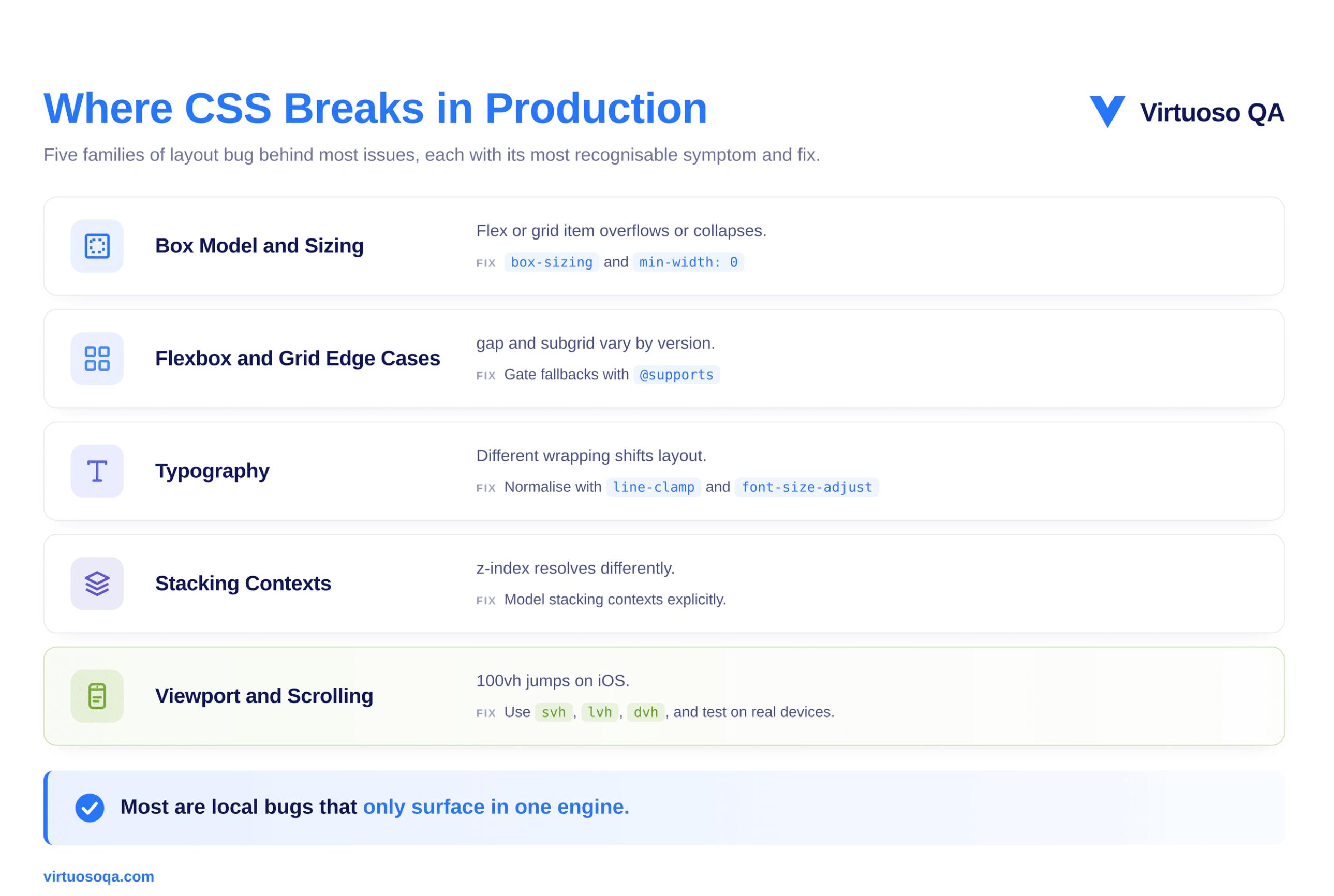
The most common production layout bug is a flex or grid item that sizes correctly in one engine and overflows or collapses in another, and the cause is usually a conflict between the intrinsic content size and an explicit constraint. A flex item with min-width: 0 set behaves differently from one without it, particularly when the item contains text that wraps differently across browsers.
The fix is mostly preventative, which means setting box-sizing: border-box globally, setting min-width: 0 and min-height: 0 on flex items that should be allowed to shrink, and avoiding percentage sizing in flex contexts unless the parent has an explicit basis.
Flexbox is well-supported, but edge cases persist, and one classic example is the gap property in flexbox, which only arrived in Safari 14.5 in April 2021 and was silently ignored by older Safari versions. CSS Grid is similarly well-supported, but subgrid took until late 2023 to reach all three engines, and the implementations still differ in how they handle edge cases involving implicit tracks and named lines.
For both, the practical approach is to test on the oldest browser version in the supported matrix and to gate any fallback behaviour behind feature queries.
Type renders differently across engines because antialiasing strategy, hinting behaviour, fallback-font selection, line-height rounding, and font-feature defaults all vary, and the typographic result itself is rarely a defect, since it is an inherent property of running on different operating systems with different font engines.
The defects appear when type-dependent layout shifts produce visible reflow, for instance when a line of text wraps one character earlier in Safari than in Chrome, which can cause a card to grow by twenty pixels, push another card off the row, and produce a visible layout shift. The fix is to design with font-metric variation in mind, using line-clamp for overflow-sensitive areas and font-size-adjust to normalise x-heights across fallback fonts.
Stacking contexts are one of the most error-prone areas in CSS, partly because they are created by a long and seemingly unrelated list of properties, since setting transform, opacity, filter, position: sticky, or will-change, among others, all create a new stacking context that then constrains how z-index resolves.
Most cross-browser stacking bugs are not actually cross-browser bugs at all, but local stacking-context bugs that happen to surface in one browser and not another because of timing or repaint differences. A related symptom worth naming is position: sticky itself, which works reliably for headers and navigation bars but has historically been inconsistent inside table headers and rows across engines.
The fix is to model stacking contexts explicitly in the codebase and to avoid stacking-context-creating properties on container elements unless they are intended.
The viewport in mobile browsers behaves differently from the viewport on the desktop, because the address bar can hide and reveal itself, which changes the visible height as the user scrolls. Safari on iOS treats 100vh as the largest possible viewport height including the hidden address bar, which is what makes so many hero sections scroll unexpectedly on first load, and although the newer 100svh, 100lvh, and 100dvh units for small, large, and dynamic viewport heights address the problem directly, the older 100vh remains a common source of mobile layout bugs.
Scrolling behaviour also differs across momentum scrolling, scroll snapping, overflow on the body versus the html element, and overscroll behaviour, so the practical approach is to test scroll-dependent layouts on real iOS and Android devices rather than on desktop simulators alone.
Five disciplines together close most of the gap, and they work best applied as habits rather than as last-minute fixes.
Browsers apply different default styling to elements, and a reset stylesheet flattens those defaults to a known baseline. The classical Meyer reset from 2007 is severe, the Normalize.css project preserves useful defaults while removing inconsistencies, and Josh Comeau's modern reset offers a thoughtful middle ground informed by newer CSS features.
The choice between them matters far less than the discipline of using one at all, because sites that ship with no reset inherit the union of every browser's quirks, while sites with a reset inherit only the quirks the reset did not flatten.
Most modern CSS features no longer require the -webkit-, -moz-, or -ms- vendor prefixes, but some still do, and a long tail of legacy support continues to depend on them. Autoprefixer, run as part of a PostCSS pipeline, reads the project's browserslist configuration and applies exactly the prefixes that match the supported matrix, so the discipline is to keep the browserslist configuration current and let the tooling do the prefix work.
Writing prefixes by hand is a category of work that has been automatable for over a decade, and teams that still do it manually waste effort and miss prefixes anyway.
Browser sniffing, which means reading the user-agent string and applying CSS conditionally, was a 1990s technique that produced a 2000s mess, and modern practice replaces it with feature detection, where you write CSS that asks whether the browser supports a feature and apply the feature only if the answer is yes.
The @supports rule is the standard mechanism, so a modern stylesheet might apply a container-query-based layout where the browser supports container queries and fall back to a media-query-based layout where it does not. The browser never has to identify itself, because the stylesheet asks the right question and the right CSS runs.
Progressive enhancement is the design principle of starting with a baseline that works for the least capable target browser and then layering capability on top, which is the opposite of graceful degradation, where you start with the most capable browser and remove things for the less capable ones.
Progressive enhancement produces more robust code because the baseline is the part you can test most easily, and the enhancements either fire or they do not, while the baseline always works. Modern features such as container queries, :has(), and scroll-driven animations lend themselves naturally to this approach, because their natural fallback is simply the absence of the enhancement rather than a broken layout.
The most reliable cross-browser CSS in 2026 is, in many cases, also the most modern, which is counterintuitive but consistent. Container queries reduce the brittleness of layouts that responded to viewport size when the real constraint was component size, logical properties such as margin-inline and padding-block work consistently across writing modes and language directions, and the cascade-layers feature brings predictable specificity to large codebases.
Each of these narrows the surface area for cross-browser bugs because each one replaces a class of bug-prone workaround, so adopting modern CSS is, paradoxically, itself a cross-browser strategy.
A practical toolkit for this work comes down to a small number of high-leverage resources rather than a large collection of tools. Can I Use remains the canonical reference for what is supported where, ideally cross-checked against the project's own browserslist. Autoprefixer, configured through PostCSS and a current browserslist file, handles vendor prefixing without manual effort.
A modern reset such as Normalize.css or an in-house equivalent establishes the baseline, the @supports rule built into the language is the standard tool for feature detection, and container queries, logical properties, and the cascade-layers system each replace a category of older, more bug-prone technique. Each browser's devtools includes a layout inspector that surfaces flex, grid, and stacking-context behaviour, and the Interop project dashboard gives an annual benchmark of where the engines are converging and where they are still apart.
The list is short on purpose, because cross-browser CSS is mostly a discipline problem rather than a tools problem. A team that uses the basics consistently will outperform a team that owns more tools but applies them inconsistently.
A European multi-brand retailer launched a redesigned category page across its websites, and the redesign leaned heavily on modern CSS, using container queries for component sizing, the :has() selector for selection-state styling, and view transitions for inter-page navigation. The performance metrics looked good in development, the user research had been positive, and the site shipped, but within forty-eight hours the analytics team flagged a drop in conversion on certain device segments.
The diagnosis took most of a day. On the most recent desktop browsers the layout worked exactly as designed, but on browser versions roughly twelve to eighteen months behind current, the absence of :has() support meant the selection-state styling never fired, which left the cart-affordance card looking inactive even when a product had been added. Users on those older versions were adding items to the cart, seeing no visual confirmation, and reasonably assuming the action had failed.
The fix was not the CSS itself but a feature-detected fallback, with an @supports selector(:has(*)) rule wrapping the modern styling and a simpler, attribute-based fallback handling the same state for browsers without :has() support. The fallback was less elegant but functionally complete, and the conversion rate recovered within twenty-four hours.
The deeper lesson was about verification rather than syntax, because the redesign had been tested manually on the most recent browser versions sitting on the team's developer machines, and the older versions were overlooked simply because nobody on the team was running them.
Manual testing on developer hardware caught none of the issue, whereas continuous automated cross-browser verification would have caught all of it before launch.
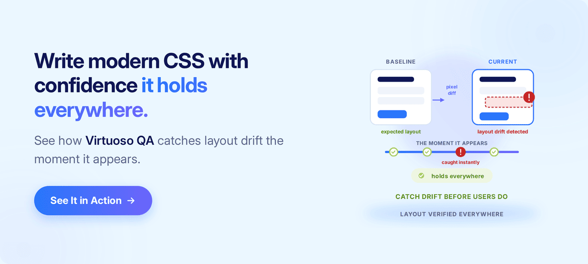
Cross-browser compatibility work falls into two halves. The first half is preventative, which means writing CSS that minimises the surface area for bugs, and most of this guide so far has been about that half. The second half is verificational, which means proving that the CSS works on every browser, on every device, every time the application changes.
Most teams invest heavily in the first half and lightly in the second, and the result is sites that are designed for compatibility but shipped without compatibility verification, where bugs slip through to production not because the CSS was wrong but because nobody ran the test that would have caught the wrongness.
Three verification disciplines together close that gap.
This is the space an AI-native, composable testing platform occupies naturally. Virtuoso QA supports cross-browser execution as a default, with self-healing that keeps tests valid as the application changes and AI-augmented object identification that handles browser-specific selector variations without rewriting tests, so the work shifts from authoring browser-specific tests to authoring journey-level tests that run across the whole matrix unmodified.
A useful frame for all of this is the layout trust gap, which is the distance between what the developer sees on a laptop and what the user sees in their own browser. Three sources contribute to that gap.
Each of those gaps is real, and each is closable, but only with verification. Eyeballing a page on a developer machine measures the first inch of the gap, whereas continuous cross-browser and cross-device verification measures all three. Layout consistency, in the end, is a property of your test suite rather than of your stylesheet.

Five recurring mistakes account for most of the cross-browser issues that reach production.
Cross-browser compatibility is the default discipline for public-facing web work, but a few contexts genuinely soften the priority, and it is worth being honest about them.
An internal line-of-business application deployed only inside an organisation whose IT policy mandates a single known browser version faces a far smaller compatibility surface, so the work is still useful but the matrix is one rather than many.
An application built with web technology and shipped through a native container, such as Electron on the desktop or a WebView wrapper on mobile, ships with a specific embedded engine, so again the matrix is one and is controlled by the container.
And some products serve an audience where one browser dominates beyond statistical doubt, where investment in the long tail still produces some value but the trade-off against other engineering work shifts.
For everything else, including most public-facing consumer and enterprise software, cross-browser compatibility is one of the disciplines that separates a site that works from a site that works for everyone.

Try Virtuoso QA in Action
See how Virtuoso QA transforms plain English into fully executable tests within seconds.