
Blog
Browser Compatibility Testing: What it is and How to

Published on
June 24, 2026


A practitioner's guide to browser compatibility testing, the five dimensions to cover, the matrix most teams get wrong, and how to do it properly.
Browser compatibility testing verifies that a web application works correctly across the realistic combinations of browser, viewport, device, operating system, and locale where real customers will use it. The discipline matters more now than a decade ago, not because rendering engines fragmented further, but because they consolidated while viewport, device, network, and locale variance widened.
This guide covers an honest definition, why the cost of failure has risen, what actually fragments now, the five dimensions to test, how to build a risk-based matrix, how to write test cases, and where the discipline is heading as AI writes more frontend code.
Browser compatibility testing verifies that a web application works correctly across the realistic combinations of conditions where its customers will encounter it. Visual rendering, functional behaviour, performance, and accessibility are all in scope, and a test passes only when all four hold across the matrix that matters for that application.
The shorter version is that a website which works on the developer's laptop is not yet a website. The website exists when it works on the customer's actual device, in the customer's actual browser, on the customer's actual network, in the customer's actual locale.
Browser compatibility testing differs from cross-browser testing only in emphasis. Cross-browser testing tends to focus on functional parity across rendering engines, while browser compatibility testing covers the same ground plus visual rendering, performance, responsive layout, and accessibility. Both describe the same underlying discipline, and the industry uses them interchangeably in most contexts.
Browser compatibility testing has been on testing curricula for two decades. The reason it still matters is not inertia. The reason is that the cost of failure has risen, and three forces concentrate the risk.
A counterintuitive truth defines modern browser compatibility testing. The rendering-engine layer consolidated, and the rest of the stack fragmented.
Five engines mattered in 2014, Blink, Gecko, Trident, EdgeHTML, and WebKit. By 2026 the picture has narrowed sharply.
Chromium-based Blink now powers more than three quarters of every web session served anywhere, with WebKit the other engine that matters for mainstream traffic and Gecko a meaningful minority.
Trident and EdgeHTML have retired, Microsoft Edge now runs on Blink, and most secondary browsers such as Brave, Opera, and Samsung Internet ship Blink or WebKit derivatives.
The implication is direct. The engine-level fragmentation that drove a decade of compatibility discipline is largely gone, because a modern Chromium build behaves similarly across Chrome, Edge, Brave, Opera, and Samsung Internet. Safari on iOS and macOS is the meaningful outlier, with Firefox holding third place.
The fragmentation moved elsewhere. Viewport sizes proliferated, device performance variance widened, network conditions diverged sharply between markets, and accessibility tooling differentiated. The combinations a customer-facing application must handle have multiplied even as the engines underneath consolidated.
The teams still testing rendering parity across engines that no longer differ much are spending budget on yesterday's problem. The teams measuring compatibility across viewport, device, network, OS, and locale are testing what actually breaks production today.
A useful framework structures the test plan around the five dimensions where real-world variance produces real-world defects.
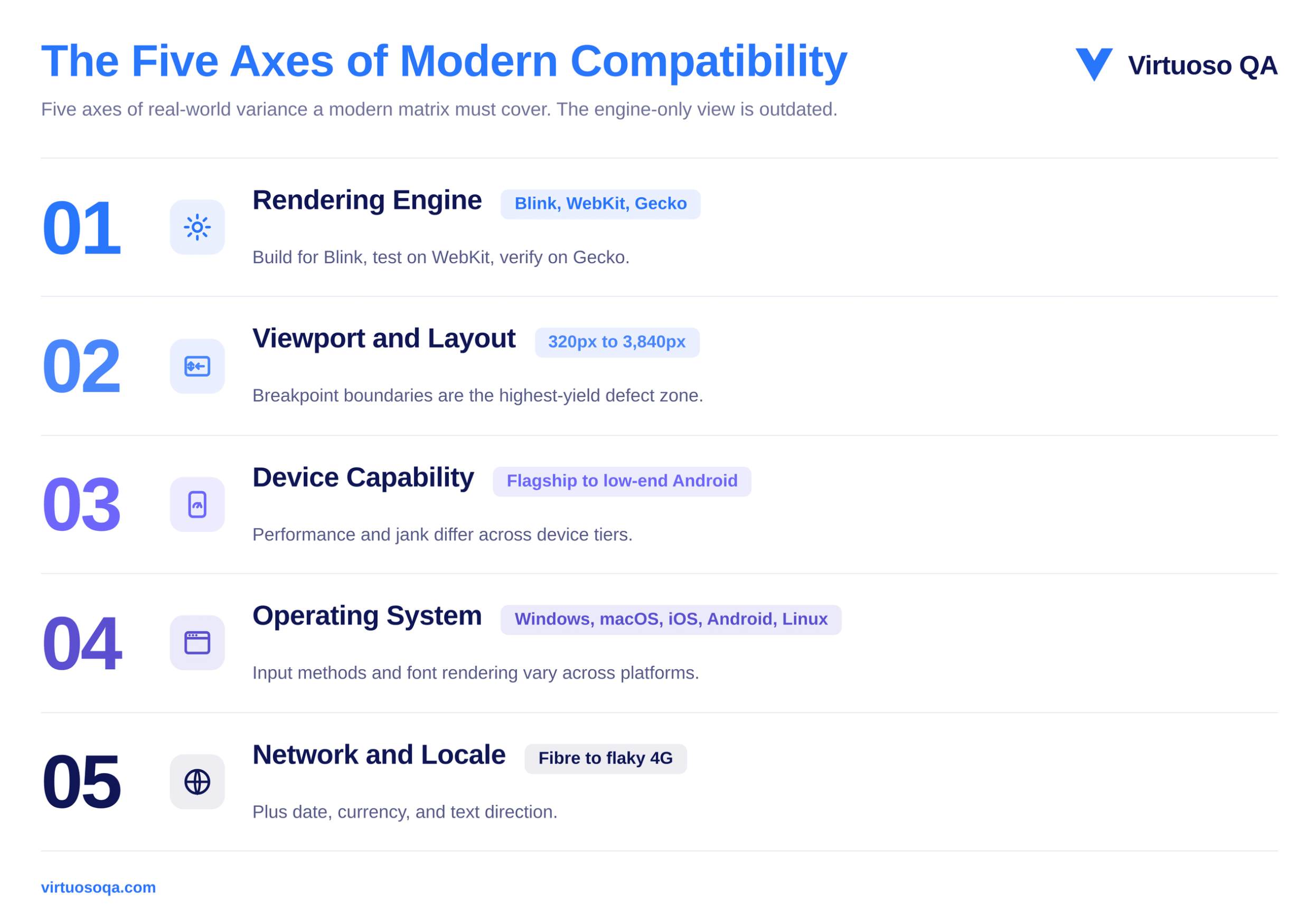
The first dimension covers the rendering engines themselves, which today come down to Blink, WebKit, and Gecko. Differences between them have not disappeared entirely, and they show up most often in how each engine supports particular CSS features, how it renders fonts, and how its JavaScript runtime behaves, though the gap between them has narrowed considerably over recent years.
For most applications, you can cover the engine layer well by testing one major Blink-based browser, one Gecko-based browser such as Firefox, and Safari on both iOS and macOS, since Safari is the one engine that still behaves meaningfully differently from the rest.
A simple way to hold the approach in mind is to build for Blink because it carries the majority of traffic, then test on WebKit to catch the Safari-specific issues, and finally verify on Gecko to confirm nothing has broken for Firefox users.
The second dimension is viewport size. An application has to render into a container that can be anywhere from a 320-pixel mobile width to a 3,840-pixel ultra-wide desktop, and it must respond predictably at every breakpoint in between those extremes.
Modern responsive design absorbs most of this variance on its own, but experience shows that the boundaries between breakpoints remain the single highest-yield zone for layout defects, which is exactly where testing attention pays off.
The third dimension is device capability. A flagship phone with eight gigabytes of memory and a high-end graphics processor renders the same page at a very different cost than a low-end Android device with two gigabytes of memory and a budget processor, and as a result, performance defects, animation jank, and scroll behaviour all differ between them.
Testing on representative devices from across the performance spectrum is what surfaces those differences before customers run into them.
The fourth dimension is the operating system. Form rendering, file uploads, keyboard behaviour, font availability, and the integration of accessibility tools all vary across Windows, macOS, iOS, Android, and Linux.
These operating-system differences matter most for applications that are heavy on user input and for applications that rely on platform-specific capabilities, so they deserve more attention in those cases than they would for a simple content site.
The fifth dimension is the environment the application runs inside. Network conditions range from gigabit fibre at one end to flaky 4G at the other, and locale settings affect how dates are formatted, how numbers and currency are displayed, and which direction the text runs.
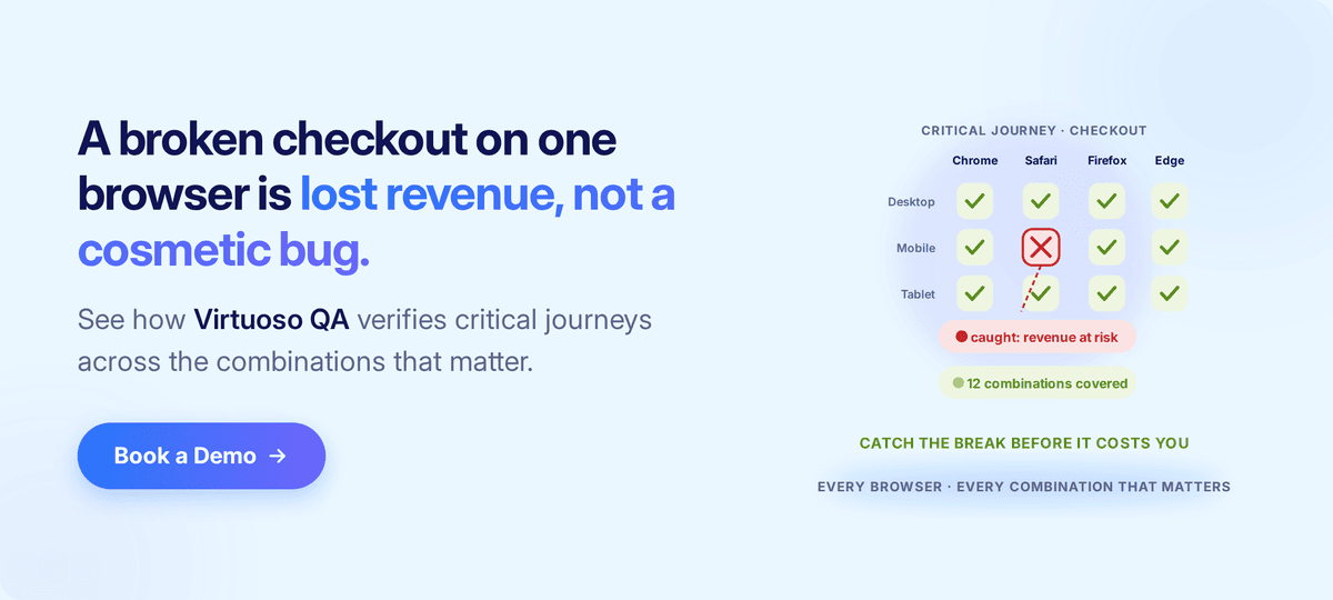
A wealth-management dashboard that works flawlessly on a London-based developer's laptop can therefore fail in subtle ways for a customer in Singapore who is on a different locale and a very different network profile.
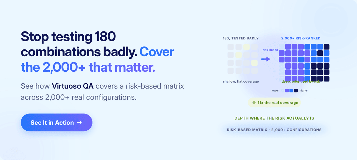
A common failure pattern recurs across teams. They build a matrix by listing every browser they can think of, then every operating system, then every viewport size, and finally they test the entire Cartesian product of all of them.
Five browsers, three operating systems, four viewport categories, and three network conditions together produce one hundred and eighty combinations. No team has the budget to test all one hundred and eighty properly, so in practice they end up testing none of them well.
A risk-based matrix produces far better results at a lower cost, and it is built from two inputs rather than from an exhaustive list. The first input is the real customer-traffic distribution, which comes from analytics and tells you which browsers, operating systems, viewports, and countries the top eighty per cent of customers actually use. That distribution will be heavily skewed, and the right response is to lean into the skew rather than fight it.
The second input is the business-criticality of each path, because a claim submission plainly matters more than a marketing page, and a portfolio manager's trading dashboard matters more than the help centre. Critical paths therefore warrant deep coverage, while marginal paths only warrant smoke coverage.
The result of working this way is a matrix of perhaps twelve to twenty combinations covered deeply, rather than one hundred and eighty combinations covered shallowly. The risk surface ends up better protected, and the testing budget produces considerably more value for every pound spent on it.
Regional variation is the point at which the standard article tends to end and the genuine practitioner conversation begins, because browser share is anything but uniform across the world. The clearest way to see why that matters is to work through an example.
Imagine a wealth-management application aimed at retail investors, and follow how its compatibility matrix would have to change as the business carries it into different markets.
At home in the United Kingdom and the United States, the team might find Chrome leading, Safari strong on mobile, and Edge taking a meaningful slice that runs a little higher in the United Kingdom because of the enterprise Microsoft 365 footprint.
Carry the same application to Japan, though, and the picture would shift, because Safari tends to be far stronger there on the back of high iPhone penetration, so the matrix that worked at home would now under-test the browser most of the customers are actually using.
Carry it to India and the team would likely meet Chrome dominance instead, accompanied by a long tail of low-end Android devices that no London-based test lab routinely exercises.
Move on to South Korea and Samsung Internet would become a serious contender in its own right, carried by the local share of Galaxy devices.
The exact figures matter less than the lesson, which is that each market rearranges the priorities, so the figures themselves should always be pulled fresh from current browser-share analytics for the period and regions in question.
There is a useful practitioner insight that sharpens all of this. Safari share is not merely a number, because it also signals purchasing power, given that Safari users are by definition on Apple hardware. Luxury and high-value brands should therefore weight Safari more heavily than its raw percentage alone would suggest.
The geographic dimension matters most of all for organisations that are expanding internationally, because the matrix that served them perfectly well at home will not cover the new markets they are entering.
Several practical implications follow from that:
A further practitioner distinction sharpens the test design, because compatibility defects fall into two distinct categories. A visual regression is a defect in how the page renders, such as a misaligned button, a font that failed to load, a colour that has come out off-shade, or an element that has slipped off-screen, while the underlying functional behaviour remains entirely unaffected.
A functional regression is the reverse, a defect in how the page behaves, such as a form that will not submit, a button that does not respond, or an upload that fails, even though the visual rendering may look perfectly correct.
Both categories matter, and crucially, different test designs are needed to catch each of them.
Visual regressions are caught by techniques such as pixel comparison, layout comparison, and snapshot testing across browsers and viewports. Functional regressions are caught instead by behavioural testing that simulates real user interactions and then asserts on the resulting state changes, doing what a user would actually do rather than only looking at what a user would see.
A complete compatibility plan therefore covers both, in proportion to the application's exposure, which means marketing pages weight visual testing heavily while transactional applications weight functional testing heavily.
A practical process moves a team from intent through to coverage in five steps.
Pull six months of analytics, then identify the top combinations by traffic and, separately, the top combinations by revenue, because the two will overlap but will not match exactly.
Combine the traffic distribution with the business-criticality of each journey, select twelve to twenty combinations for deep coverage, set aside another twenty for smoke coverage, and defer the rest without guilt.
Run smoke tests across all the combinations to catch catastrophic failures quickly, deep functional tests on the priority combinations, visual regression tests where rendering matters most, and accessibility checks integrated into the suite for the combinations that serve accessibility-sensitive customers.
Run compatibility tests on every pull request for the critical paths and on every nightly build for the wider matrix, with failures blocking the release and producing clear, actionable reproduction information.
Browser distribution changes from quarter to quarter and regional traffic shifts as the business expands, so review the matrix every six months, or sooner whenever the business enters a new market.

A clear test case is what makes coverage repeatable rather than ad hoc. Each one should carry a test identifier, the target browser, the version, the device, and the operating system, followed by the actions to perform, the expected outcome, and the actual result, with all of those environment variables formatted consistently from one case to the next.
It also pays to prioritise the components most exposed to browser variance, because a payment button's behaviour matters a great deal more than the rendering of a static footer.
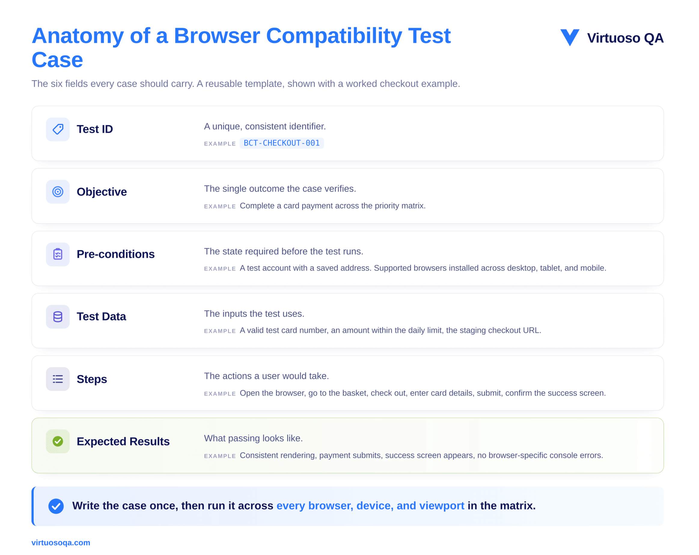
A worked example shows the structure clearly:
The same case is then run across the whole matrix rather than being rewritten for each browser, and it is precisely at that point that the authoring approach you have chosen starts to drive your costs.
The short version is that a modern compatibility matrix has simply become too large, and it shifts too often, for manual testing to cover it on its own.
Automation therefore has to carry the breadth across the matrix on every build, while manual effort is best reserved for exploratory checks and for the subtle visual nuances that a human eye still catches better than a machine.
As suites grow over time, the balance tips further towards automation, ideally with self-healing in place to keep maintenance manageable.
A new pattern has emerged alongside the rise of AI coding assistants in frontend development. AI-generated CSS, component code, and layout changes now ship faster than human review can realistically catch every regression, and the generated code may quietly use newer features that the latest Chromium supports but Safari does not, rely on browser APIs that behave differently from one engine to the next, or introduce viewport-specific assumptions that the model never actually validated.
Three failure patterns are visible in the field with some regularity:
The frequency of compatibility defects has risen noticeably for teams that ship AI-generated frontend code without making a matching investment in continuous compatibility verification.
The right response is not to slow the AI down, because that surrenders the very speed it offers. The right response is to verify continuously so that the speed is safe.
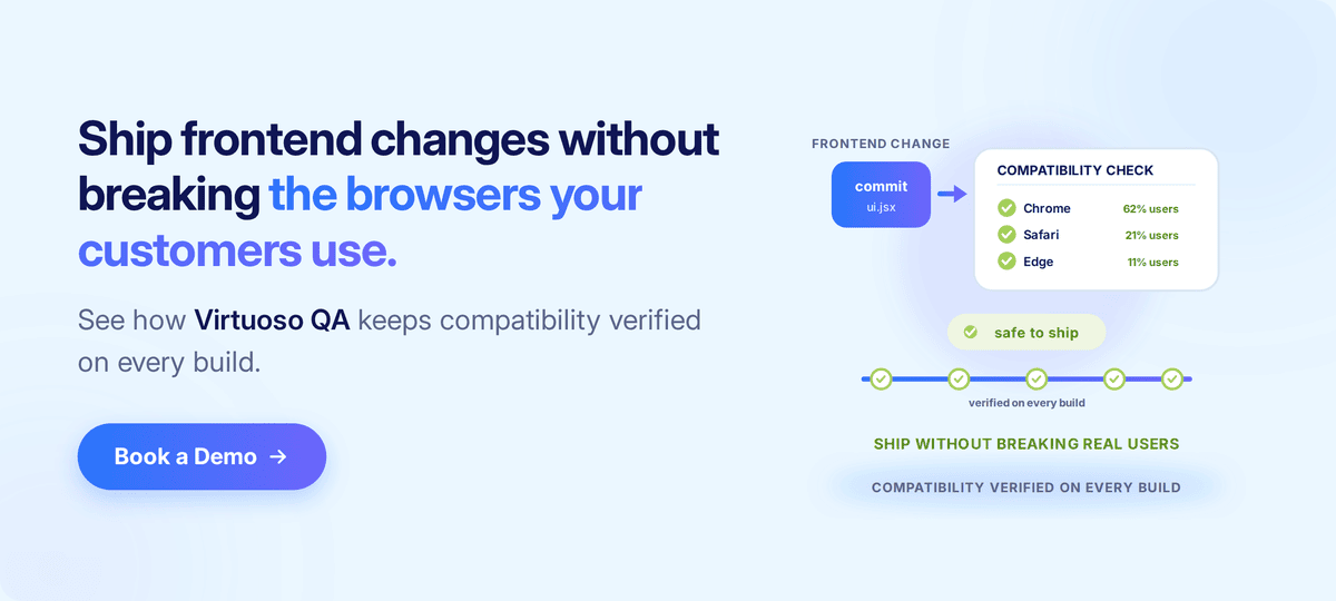
Verifying compatibility across all five dimensions, on every single build, is exactly where an AI-native test platform earns its place. Virtuoso QA runs browser compatibility tests across a cross-browser grid that spans more than two thousand configurations, and because the tests are authored in plain English, the same journey runs across that whole matrix without having to be rewritten for each engine.
Self-healing absorbs the minor interface changes that would otherwise break tests on every frontend refactor, and within a single journey the platform combines visual checks, functional assertions, accessibility validation, and API verification, while AI Root Cause Analysis explains why a test failed on one particular browser-and-device combination rather than simply reporting that it did.
Plugged into the pipeline through its CI/CD integrations, compatibility failures block merges before they ever reach production, which is what keeps the matrix verified continuously as the market underneath it shifts.
A short checklist captures the discipline in one place.
The list is deliberately short, and it is short for the very reason that browser compatibility testing so often fails in practice. The discipline itself is not complex. What is genuinely rare is the consistency to practise it.
Browser compatibility testing is no longer the engine-parity exercise it was a decade ago. The engines have consolidated, and the real variance has migrated into viewport, device, network, and locale, which means the teams that protect revenue are the ones testing a risk-based matrix built from real traffic and real business-criticality, rather than a Cartesian product of everything they can name.
Cover the critical journeys deeply, reflect the regions the business genuinely serves, verify continuously as AI accelerates the pace of frontend change, and review the matrix as the market shifts beneath it.
Done consistently, that is what keeps the customers an organisation has already worked so hard to win.

Try Virtuoso QA in Action
See how Virtuoso QA transforms plain English into fully executable tests within seconds.