Blog
Functional UI Testing: Validating User Interactions

Virtuoso QA
Published on

Table of contents
Lorem ipsum
Lorem ipsum
Lorem ipsum
Lorem ipsum
Lorem ipsum
There is a difference between a button that exists and a button that works. Most UI test suites do not know it. The result is the failure every product manager dreads: the test passes, the build ships, the customer clicks the button, and nothing happens.
Functional UI testing exists to close that gap. It is the layer of testing that proves the application is not just built but actually usable by the people it was built for.
This guide covers what functional UI testing is, how it differs from the disciplines it gets confused with, the three checks every interaction must pass, the eight interaction types every enterprise application has, the defects functional UI testing is built to catch, and how AI-native platforms are changing what good UI testing looks like.
What is Functional UI Testing?
Functional UI testing is the verification that every interaction a user can perform through the interface produces the behaviour the system promises.
It validates three things together:
The element is present
The element behaves correctly
The user sees the result
The interface is the contract between the system and the user. Functional UI testing verifies that contract holds under every interaction the user is permitted to make.
Three properties define a functional UI test that earns its place in the suite.
It Verifies Behaviour Through the User Interface, Not Behind it
API tests prove the function exists. Functional UI tests prove the user can reach it, trigger it, and receive its result through the screen. The path through the interface is what is being tested.
It Tests the Contract, Not the Cosmetics
Visual regression catches a logo that has shifted a pixel. Functional UI testing catches a submit button that no longer submits. The two disciplines complement each other and neither substitutes for the other.
It Validates the Full Loop, Not Just the Event
A user does not only click. The user clicks, expects something to change, sees the change, and acts on it. The full loop of action, response, and feedback is what functional UI testing verifies. Tests that stop at the click miss the half where the user learns whether the action worked.
The shorthand: Unit tests prove the engine turns. Functional UI tests prove the steering wheel does what the driver expects.
Functional UI Testing vs Adjacent Disciplines
Several terms around UI testing overlap in everyday conversation but mean different things in practice. Using the wrong one leads to spending time and money on the wrong type of testing and leaving real gaps uncovered.
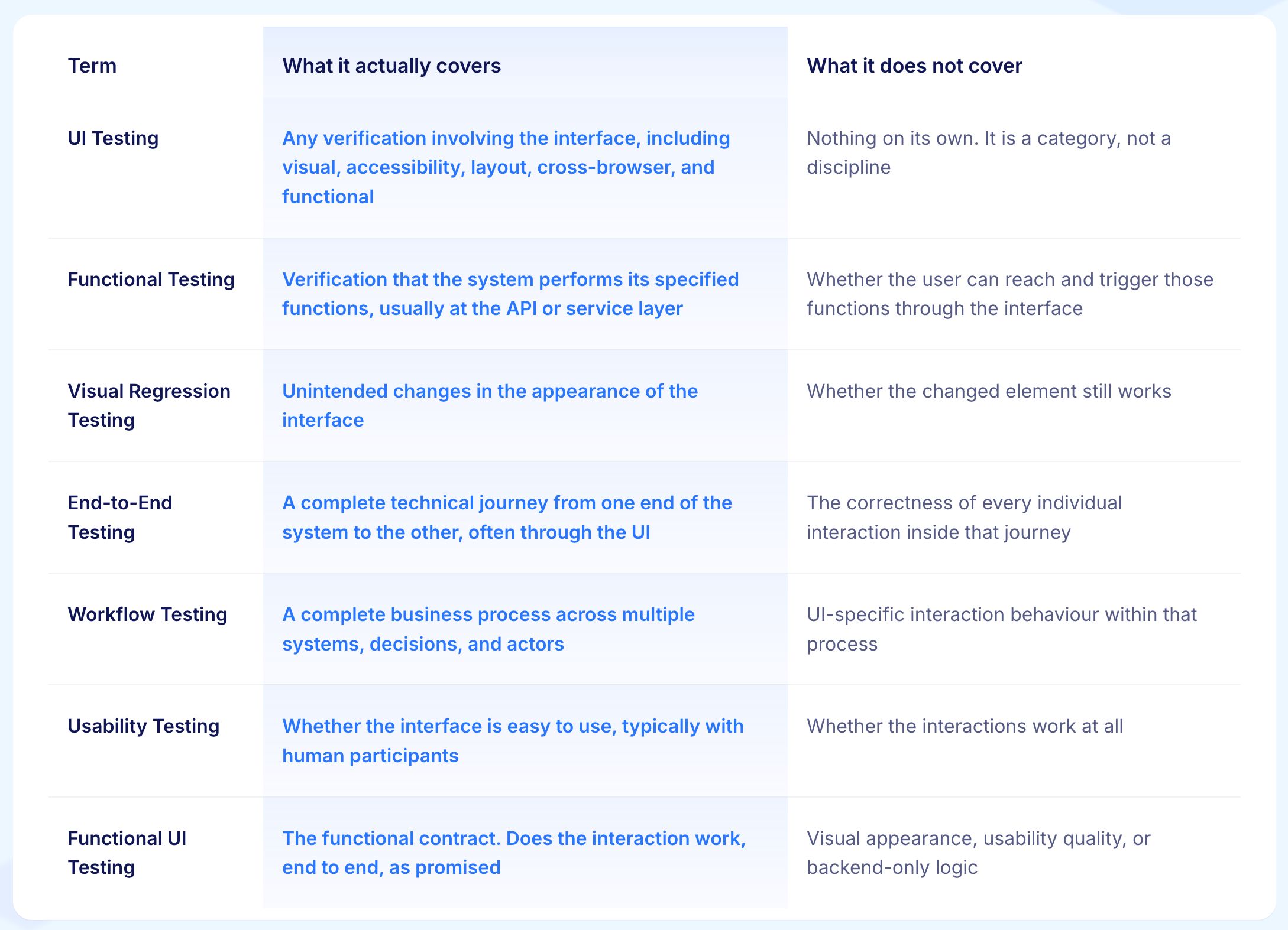
The simplest way to think about it: Functional UI testing checks whether what the user tries to do actually works, through the screen, every time.
The Three Checks Every UI Interaction Must Pass
Most functional UI tests only check one or two of the three things a real user interaction depends on. The tests that skip the third are the ones that pass while the user runs into a problem. One simple frame, used every time, closes that gap.

Check 1: Is It There?
The element the user needs is on the page, visible, turned on, and reachable. The submit button is showing. The search field can be clicked. The approve menu item appears for users who have the right access.
This is the easiest of the three to check and the only one many test suites actually check. Tests that only confirm the element is there confirm the interface exists. They do not confirm it works.
Check 2: Does It Work?
The element does what it is supposed to do when the user interacts with it. The button submits. The dropdown filters. The wizard moves forward. The modal opens with the right information. The autocomplete shows matching results in a reasonable time.
This is where most real production problems live. The element is there, it can be clicked, it just no longer does the thing it is labelled for. The reason is usually a code change somewhere upstream that broke the connection without removing the element from the screen.
Check 3: Can the User See the Result?
The user sees what happened in a way they can act on. The success message shows up. The cart count goes up. The error message points to the right field. The page goes where it should.
This is the most commonly skipped check. The system can do the right thing in the background and fail to show it. The order went through but the confirmation screen never appeared. The setting was saved but the page did not update. The claim was submitted but the queue count never changed. From where the user is sitting, nothing worked, no matter what the backend did.
A functional UI test that skips any of these three checks can pass while the user hits a wall.
Nine Common UI Interaction Types and How to Test Them
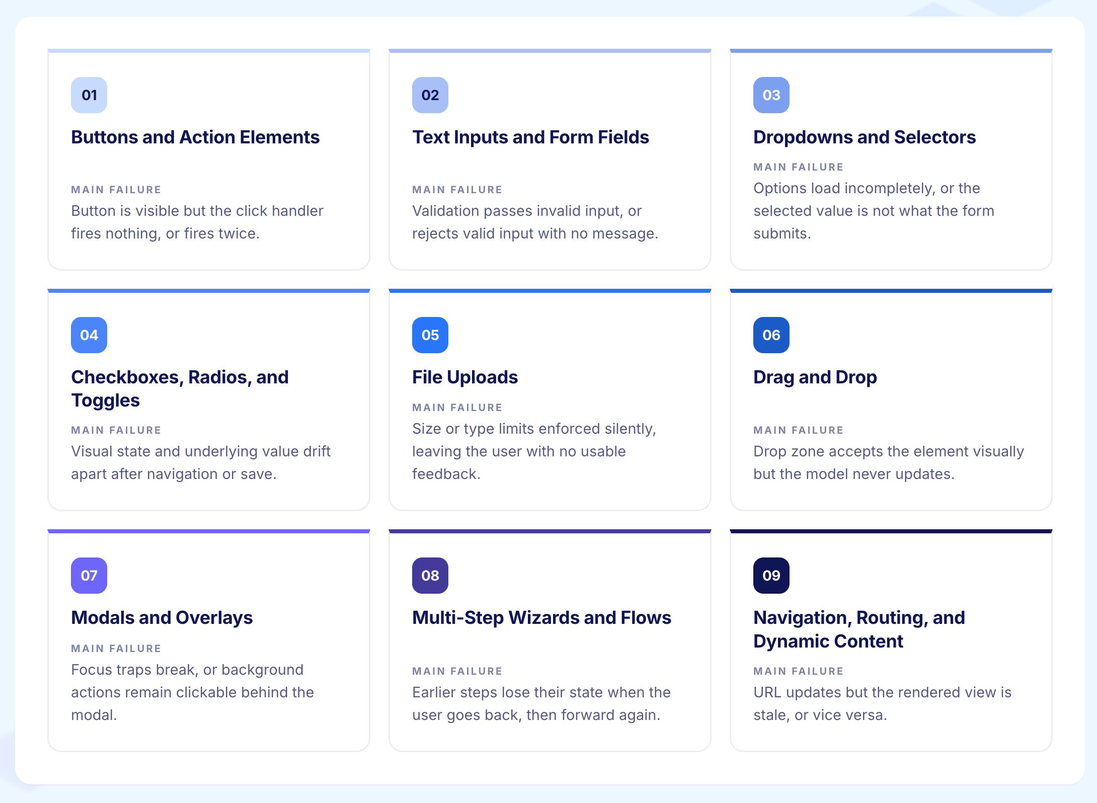
1. Buttons and Action Elements
The button shows up, the click triggers the right action, and the user sees what happened.
Is it there: The button is visible and enabled for the right users in the right context. A button that shows for users who cannot use it is a problem before they even click it.
Does it work: The click fires the right action. Common problems here are the button firing twice if clicked quickly, a keyboard shortcut accidentally triggering it, and disabled-state styling that looks one way while the underlying state is different.
Can the user see the result: The user sees confirmation that the action happened. A button that submits silently with no feedback leaves the user guessing whether anything occurred.
Tests should check every state the button can be in: enabled, disabled, loading, and any error state, not just the normal working state.
2. Text Inputs and Form Fields
Each input field is its own small system. It should accept valid input, reject invalid input with a clear message, keep what the user typed when they navigate away and come back, work correctly when the user pastes text, behave predictably with browser autofill, and respect any length or character limits.
Is it there: The field is visible, focusable, and enabled for the right users.
Does it work: Valid input is accepted. Invalid input is rejected with a message that tells the user what is wrong, not just that something is wrong. The field handles paste, autofill, special characters, and locale-specific input like right-to-left text without breaking.
Can the user see the result: Validation messages appear in the right place. Entered values are preserved if the user navigates away and comes back. The field state reflects what was actually saved.
Good functional UI testing applies equivalence partitioning and boundary value analysis here. Valid input, invalid input, exact maximum length, one character over, empty input, spaces only, and special characters all deserve their own test cases.
3. Dropdowns and Selectors
Single-select, multi-select, searchable, and linked dropdowns each break in different ways.
Is it there: The dropdown is visible, enabled, and shows the right options for the current user and context.
Does it work: The dropdown opens, allows a selection, and keeps that selection when the page re-renders. It updates any related fields that depend on it. It works with the keyboard as well as the mouse.
Linked dropdowns where the options in one field depend on what was chosen in another are a common source of quiet bugs, especially when the API that provides those options changes and the dropdown silently empties.
Can the user see the result: The selected value is visible after selection. Downstream fields that should update do update. If no options are available, the user sees a clear explanation rather than an empty list.
4. Checkboxes and Toggles
Simple to look at, surprising to break.
Is it there: The element is visible, enabled, and shows the correct current state before the user interacts with it.
Does it work: The selection reaches the form when submitted. The selected state stays selected. Any related fields enable or disable as expected. The keyboard works without needing a mouse.
Can the user see the result: What is shown on screen matches what is actually stored. Toggles are especially prone to showing one state visually while storing a different one, particularly after a save that happens in the background. Tests should check both what is shown and what is stored, separately.
5. File Uploads
File uploads are more complex than they look because a successful upload involves several steps: picking the file, previewing it, uploading it, server-side checking, and saving it.
Is it there: The file picker is accessible and the upload area is visible and enabled.
Does it work: The picker opens, accepts the right file types, rejects the wrong ones with a clear message, respects the file size limit, shows progress while uploading, and handles a broken connection without crashing. Tests that only check the file was selected miss most of the ways this can go wrong.
Can the user see the result: Upload progress is visible. Success or failure is communicated clearly. The uploaded file appears in the right place after completion. The state clears correctly if the upload is cancelled.
6. Drag and Drop
Easy for users, tricky to test.
Is it there: The draggable item is identifiable as draggable. Valid drop areas are visible and identifiable.
Does it work: The item picks up correctly, valid drop areas highlight when the item is held over them, invalid drop areas either do nothing or explain why, and the new position saves correctly.
Can the user see the result: The screen updates to reflect the new position after the drop. The rest of the interface adjusts as expected.
Drag and drop tests should also check the keyboard alternative. Any time drag and drop is redesigned, keyboard access tends to break at the same time.
7. Modals, Overlays, and Dialogs
Is it there: The modal opens for the right reason and shows the right content for the current situation.
Does it work: Focus is kept inside the modal while it is open. The modal closes when the user cancels. It stays open when the user is mid-action. It does not leave the page in a broken state if something interrupts it. Modals stacked on top of other modals are a common cause of state getting corrupted.
Can the user see the result: The user can see clearly what happened after confirming or cancelling. The page behind the modal reflects the correct state once the modal closes.
The cancel path is the most overlooked check. Most modal bugs are not in what happens when the user confirms. They are in what happens when the user backs out.
8. Multi-Step Wizards and Flows
A wizard is a sequence of steps that all have to work for the user to reach the end.
Is it there: Each step shows the right content and controls for the current state and user context.
Does it work: The user can move forward through each step and go back without losing what they entered. Validation fires at the right step, not too early and not too late. Progress can be saved and resumed. The final submit works correctly.
Can the user see the result: The user can see where they are in the sequence, what they have completed, and what is left. The outcome of the final step is clearly confirmed.
Keeping state between steps is the most common thing that breaks in wizards, especially when code changes how a step saves or retrieves what the user entered.
9. Navigation, Routing, and Dynamic Content
Is it there: Links, buttons, and navigation elements that take the user somewhere are visible and reachable.
Does it work: The user moves between pages correctly. The URL updates as expected. The back and forward buttons in the browser work. Links that go directly to a specific page resolve correctly. Content that loads after the page opens appears in the right place.
Can the user see the result: The user arrives at the right destination in the right state. The page is not blank, broken, or showing content from the previous session.
Single-page apps and AI-coded frontends break routing in ways that are easy to miss. Tests should check both where the user ends up and what state that destination is in, not just that the URL changed.
How to Design Functional UI Tests That Stay Stable
Writing functional UI tests is one challenge. Keeping them working as the application changes is another. Both come down to the same thing: design choices made when the test is written determine how long it stays useful.
1. Write Tests Around What the User is Trying to Do
What to o:
Describe the test in terms of the user's goal, not the element's technical identity
Find elements by their role, label, or name rather than by CSS class or page structure
Name each test by the action it verifies, not the element it touches
Why it Matters:
Tests written around what the user is trying to do survive changes to the interface. Tests written around specific selectors or page structure break every time the UI changes. Over time, intent-based tests are far cheaper to keep running.
Example:
A test for submitting an expense claim is written as:
When the user enters a valid amount and clicks Submit, the claim appears in the pending queue with the correct amount. When the Submit button moves position in the next design update, the test still finds it and still passes. A selector-based version breaks and needs manual repair.
2. Apply All Three Checks to Every Interaction
What to Do:
Check that the element is there and enabled before triggering it
Check that the action produced the right result, not just that the element was clicked
Check that the user can see the result on screen
Why it Matters:
Tests that stop after one or two of the three checks pass in situations where the user would hit a problem. All three checks together turn a passing test into real confidence that the interaction works for the user.
Example:
A test for a checkout button checks three things separately.
First: the button is visible and enabled for a logged-in user with items in the cart
Second: clicking it starts the checkout and sends the right order data
Third: the order confirmation screen appears with the correct reference number within three seconds
3. Use Test Design Techniques at Every Input
What to Do:
Use equivalence partitioning to group inputs the system handles the same way and test one from each group
Use boundary value analysis to check the edges of input ranges where problems tend to appear
Use decision tables where multiple conditions combine to produce different results
Use state transition testing where an element changes state during a session
Why it Matters:
A suite built only on the happy path misses the inputs real users actually supply. Applying these techniques produces a suite that is both thorough and not full of duplicate tests checking the same thing.
Example:
For a password reset field, equivalence partitioning gives three groups: a password that meets all the rules, one that fails one rule, and one that fails multiple rules. Boundary value analysis adds the exact minimum length, one character below it, the exact maximum, and one character above it.
4. Test at the Right Layer
What to Do:
Only use functional UI tests for behaviour that requires the interface to check: the interaction, the visual result, and the feedback the user sees
Move anything that can be checked at the API layer with the same confidence to the API layer
Keep the UI test layer focused on what only the screen can confirm
Why it Matters:
Functional UI tests take longer to run and cost more to maintain than API tests. Using them for logic that belongs elsewhere wastes time and inflates upkeep costs.
Example:
Whether a discount code produces the right price is a backend logic check that belongs at the API layer. The functional UI test checks that the discounted price shows correctly after the user enters the code, that the order total updates on screen, and that the checkout button stays enabled.
5. Make Each Test Stand on Its Own
What to Do:
Each test creates the state it needs before it runs
Each test cleans up or resets after it finishes
No test relies on a previous test having run first
Why it Matters:
A test that needs another test to have run first fails in ways that are hard to trace when tests run in a different order or in parallel. Tests that own their own setup are more reliable and easier to debug.
Example:
A test for submitting a claim creates the claim record it needs as part of its own setup rather than relying on a previous test to have created one. It runs the same way whether it runs first, last, or on its own.
6. Fix or Remove Flaky Tests Immediately
What to Do:
When a test passes one day and fails the next without any code change, treat it as a problem to fix right away
Set a clear window for fixing a flaky test, for example within the current sprint, and retire it if the fix cannot be found in time
Never leave flaky tests running in the suite and ignoring their results
Why it Matters:
A test that passes and fails unpredictably damages team confidence faster than almost anything else. When engineers expect tests to sometimes fail for no reason, they stop trusting the results. A suite nobody trusts is a suite that provides no value.
Example:
A modal test fails intermittently because it sometimes runs before the modal has fully loaded. The fix is adding an explicit wait for the modal content to appear before checking it. If the root cause cannot be identified within the sprint, the test is retired rather than left in the suite as permanent noise.
7. Make Selectors a Shared Agreement
What to Do:
Work with the engineering team to add stable test identifiers to elements, such as data-testid attributes or clear accessible names
Treat these identifiers as a shared contract between engineering and QA
Use self-healing tools to absorb minor selector changes, and review every automatic fix the tool makes
Why it Matters:
When both teams own the stability of the tests, the cost of a refactor includes the cost of keeping the tests working. Self-healing reduces the manual repair work but does not replace the need for someone to review what changed and why.
Example:
The engineering team adds data-testid attributes to all primary action buttons as part of the component library standard. When a button is refactored, the data-testid moves with it. The test continues to find the button without any manual update, and the team is alerted to the change through the self-healing log rather than through a broken build.
How Virtuoso QA Handles Functional UI Testing
Virtuoso QA is built on the idea that the actions customers depend on should keep working no matter how fast the code underneath them changes.
1. Tests Find Elements by What They Mean, Not How They Are Coded
Elements are identified by their purpose and label rather than by selector strings. The same test finds the same button even when the code around it changes.
2. Tests Are Written in Plain English
Anyone on the team can read and understand what a test is checking. Writing a test feels like describing what the user should be able to do, not like writing code.
3. Self-Healing Keeps Tests Working After Interface Changes
When selectors or page structure changes, the platform adapts the test automatically. Every automatic change is logged so someone can review it.
4. Common Interaction Patterns Are Reusable
Forms, navigation flows, modals, and wizards are built once and reused across applications. The same pattern does not need to be rebuilt for every new project.
5. GENerator Produces a First Draft From Requirements or Designs
The team reviews and improves rather than writing from scratch. The experience-based cases that only domain knowledge can produce get added on top.
6. Every Test Run Produces a Full Record
Screenshots, video, step traces, and clear pass or fail results are captured automatically. The whole team can see what happened and why.
Related Reads
Frequently Asked Questions
What is the difference between functional UI testing and UI testing?
When should I use functional UI testing instead of API testing?
What are the three verifications in functional UI testing?
What is the best way to make functional UI tests stable?
How do AI testing platforms improve functional UI testing?
How often should functional UI tests run?